
Radi(c)al Thought: Your Energy Data has a Fingerprint
written by Jesse, and edited by Carly
If there’s one thing that defines me professionally—other than my love for the energy industry—it’s my deep obsession with charts. Whether it’s chart design, chart types, or the history of charts, I can talk about them at length. Fair warning: if you ask me about charts, be prepared for a passionate and likely long-winded response.
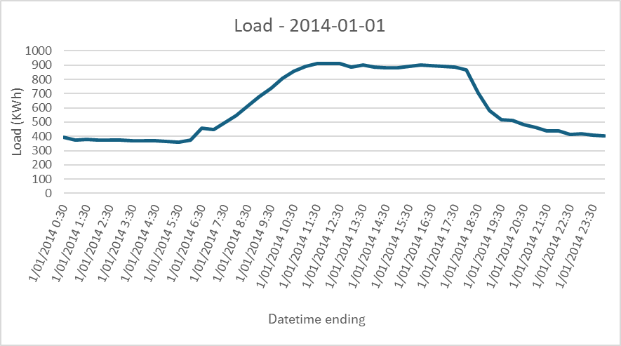
This obsession finds its ultimate expression in one of the most critical charts for any energy retailer: the load profile. These charts, which illustrate energy usage over time, are deceptively simple in concept but can reveal so much more when you dive deeper. The classic load profile is a staple in the industry. It looks something like this:
The standard load profile chart serves two primary purposes:
Energy User Insight: Helping customers and retailers understand how energy needs fluctuate over time
Energy Seller Risk: Enabling hedging teams to gauge customer energy usage, crucial for managing risk at a retailer
At first glance, it seems straightforward. Energy usage over time? Easy. Draw a line, pick a colour, and you’re done, right?
In this simple daily view, we are missing a ton of context. It’s just not possible to make informed decisions or assertions based on this data.
Even if we charted an entire year of load data in a simple line chart, what does this line show us about the consumption? Sure, we can see some peaks and troughs, maybe some trends through the seasons in the year, but do we really have the full picture? How can I be sure that I can see those days where the whole office is complaining about the heat and every air conditioner and fan is turned on? What about the days where the usage is flat, until it suddenly spikes at the peak demand time, in the middle of the day, exposing us to spot price risks?
The truth is - we simply can’t see the detail that we really need to be able to make informed decisions about this site or customer.
This was the driver behind my quest to create something that gives me a representative view of an energy user. A true load profile. Something that is unique to that customer. A load fingerprint.
It always starts with a line chart
Any data analyst would agree – the first step you take when looking at timeseries data is to chart it. And the simplest way to do so is with a line chart. This is muscle memory at this point. I open Excel, I create a line chart. But as we’ve already explored, this doesn’t quite cut it in the context of energy usage.
Let’s start with a classic mistake: plotting an entire year’s worth of load data on a single chart without much thought. It looks something like this:
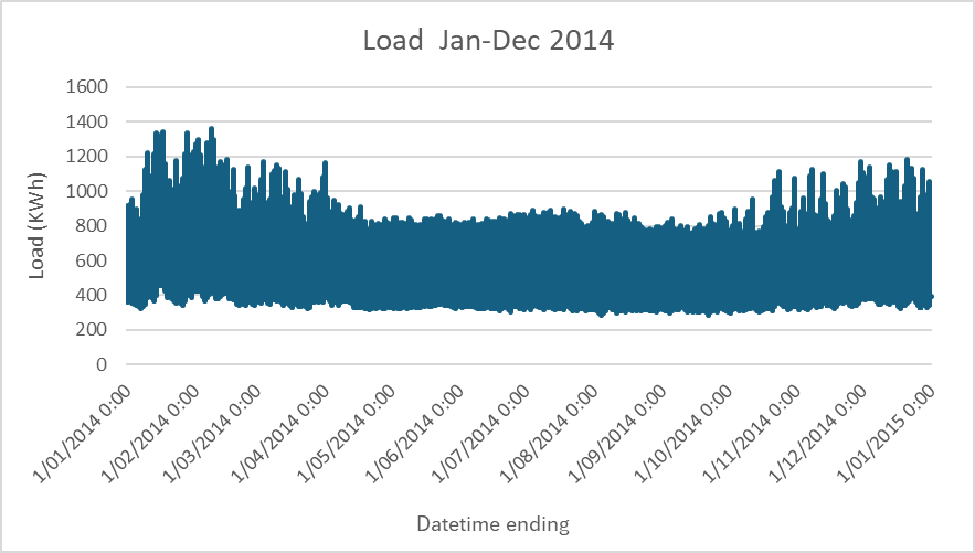
This is overwhelming. What are we supposed to take away from this chart?
The maximum load is around XX
The minimum? Somewhere around YY
The average? No idea
There might be some kind of pattern related to the day of week, but I can’t tell
Are these spikes data anomalies or mega-consumption days?
This chart tells us nothing beyond vague generalisations. So, what’s the next step? Simplify. Let’s focus on an average day instead:
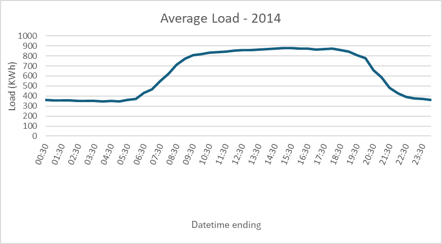
That’s better. But of course, we know that this so-called ‘average day’ might be misleading, and potentially exposing us to risk, especially if price spikes coincide with high loads. What if we’re missing crucial patterns? We need more than just an average. We need to see every day, not just a summary.
Spaghetti makes everything better
Around 2012, I stumbled upon a chart that would change everything for me: the “spaghetti chart.” These visualisations, ideal for data with periodic patterns, were a revelation. Load data has plenty of these patterns, so why not treat each day as its own line?
This was really a game-changer for me at the time.
What does this view excel at?
It highlights extreme values, showing us the highest and lowest loads
It reveals the average where the lines overlap, giving us a rough sense of trends
I still can’t see everything though. The overlaps tell a story, but only the conclusion. I need more detail.
Let’s be a little more transparent about this
What if we made each line a bit transparent? A minor tweak, but the effect was monumental.
By making each line dark grey but 92% transparent, patterns began to emerge naturally. Suddenly, extreme values and clusters of similar days were apparent at a glance. My pattern-seeking brain was delighted, able to make sense of the data in ways I couldn’t before.
The first steps towards a fingerprint
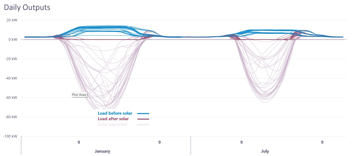
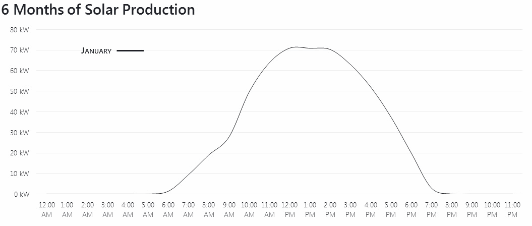
Encouraged by this success, I began to explore new ways to visualise the data. One idea? Animation. Here’s an early version of a forecast for an 80kW solar PV array, built using Excel and VBA:
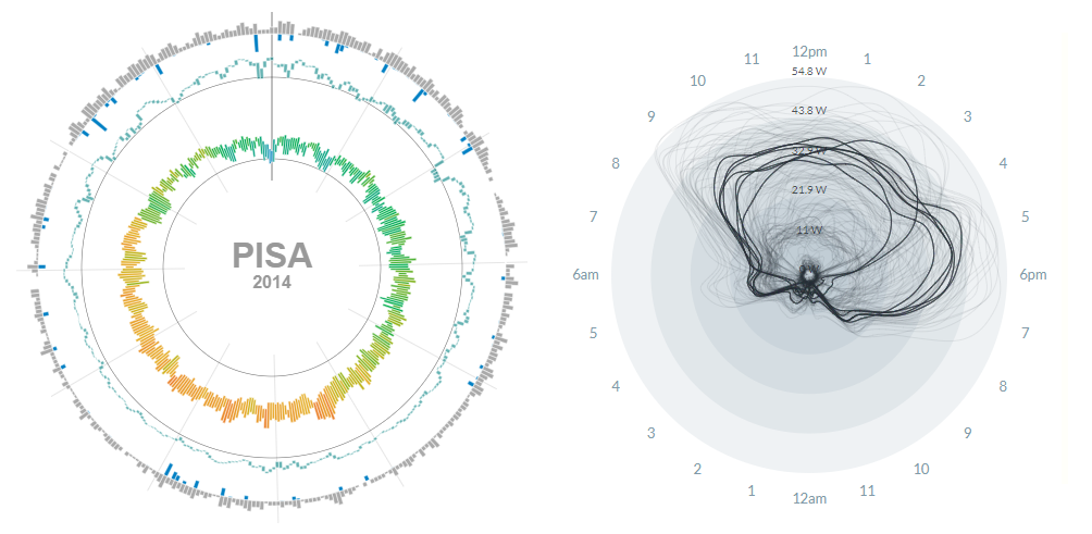
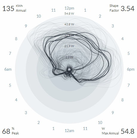
This was an exciting development, but the next major leap came in 2019 when we started experimenting with radial charts. Inspired by weather charts and seasonal data visualisations, I asked: why not make our load profile radial?
Radial charts offered something new - an intuitive way to read patterns by leveraging the human brain’s ability to recognise shapes. Much like how people see cats, faces, or entire scenes in clouds, we as humans are wired to detect familiar shapes in unfamiliar spaces. By shifting the load profile into a radial format, the spaghetti lines suddenly formed more than just a mess of overlapping days. They formed a shape.
And as with those cloud-formed cats, once we recognised the patterns in the radial chart, it became hard to not see them. Peaks of high energy usage, low dips, recurring patterns - these shapes revealed themselves in a way the traditional format never could
Weird = good
In the world of energy data visualisations, we are conditioned to expect one thing: XY charts. Everywhere you look, from operational dashboards to industry reports, the standard line or bar chart is the norm. The XY format is comfortable, familiar, and easy to understand, so it's no wonder that it's been the default choice for visualising load data. But comfort doesn't always lead to the best insights. Sometimes, it's the "weird" options that open the door to something unique.
One of our earliest demos for Moose was to an Australian energy retailer. Andrew, the customer, wasn’t sold. “I want to see it in the traditional XY format,” he insisted. So we made a deal: try it for a month. If you still hate it, we’ll build you the traditional view.
A month later, Andrew’s response was clear: “I love it.”
It turned out that the strangeness of the radial chart was its strength. It forced users to see data differently, offering new insights they hadn’t considered before. Five other users received the same offer, and none asked to go back to the traditional view.
Weird, it seems, can be good.
A fingerprint as unique (or weird) as the energy user
The journey from line charts to radial load fingerprints was never about aesthetics or novelty - it was about finding a way to truly capture the complexity and individuality of each energy user’s consumption and the patterns we now see.
The weirdness of the radial chart, once a source of confusion, became its greatest strength. By challenging the traditional views and forcing us to look at energy data differently, we unlocked new insights that would have otherwise gone unnoticed.
In the same way that no two human fingerprints are alike, every energy profile has its own story, weirdness, and patterns. My key takeaway from this process is that embracing what seems weird at first glance is key to re-shaping your thinking.

CORE for Alinta Energy
Alinta Energy, Australia’s 4th largest energy retailer, sought to streamline its operations and enhance its growth prospects with the implementation of a CIS capable of supporting their nation wide C&I and Mass Market business.
Read CORE for Alinta Energy case study
Beige Things Newsletter
We're keeping the Beige Tech team connected with our monthly dose of workplace fun!
Read Beige Things Newsletter case study
Consumer Data Right (CDR) for Energy
Consumer Data Right (CDR) provides customers with greater access to their energy and banking data than ever before.
Read Consumer Data Right (CDR) for Energy case studyIkeGPS
A custom application to replace a legacy system that was lacking end-user controls.
Read IkeGPS case study
Managing long-running queries and locks
Identifying and monitoring long-running transactions is crucial for maintaining database performance and stability.
Read Managing long-running queries and locks case study